SaaS Changelog Examples: 16 Worth Learning From
A look at 16 real SaaS changelogs, what they do well, and what you can learn when building your own.

A good changelog has a simple job: tell customers what has changed in your product. But there are plenty of ways to do that, and the best examples make some very different choices.
Some are beautifully structured. Some are extremely minimal. Some make feedback part of the story. Some put the people who built the feature front and centre. One of them is really aimed at developers rather than customers at all.
So rather than treating a changelog as a particular design pattern, it is more useful to look at what these pages actually do.
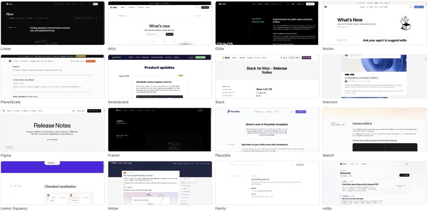
Here are 16 SaaS changelog examples worth looking at — including what we think is worth learning from each one.
What is a SaaS changelog?
A SaaS changelog is a public record of changes made to a software product.
It gives customers somewhere to see what is new and what has changed.
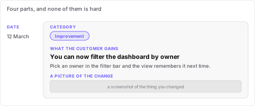
A useful changelog entry does not need to be complicated. In most cases, four things are enough:
- A date — so the reader knows when the change happened.
- A category or label — so they can quickly understand what kind of update it is.
- A description — explaining what changed and, ideally, what the customer gets from it.
- A picture — usually a screenshot or product image showing the change.
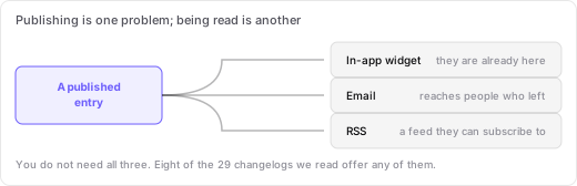
There is another piece to consider: getting people to the page. A changelog can be distributed through an in-app widget, email or RSS, turning a static archive into an ongoing product communication channel.
16 SaaS changelog examples worth learning from
The examples below take quite different approaches. That is useful, because there is no single “correct” changelog format.
1. nolby
nolby is our feedback management product, which includes an integrated changelog tool.
Entries carry a date and a customizable status label, and a Subscribe button sits at the top of the page, so a reader can be told about the next one without having to come back. The newest entry gets a full-width card with room for a screenshot, and older ones drop onto a timeline beneath it, so the page does not read as a wall of identical rows. The changelog also sits in the same navigation as the feedback board and the roadmap.
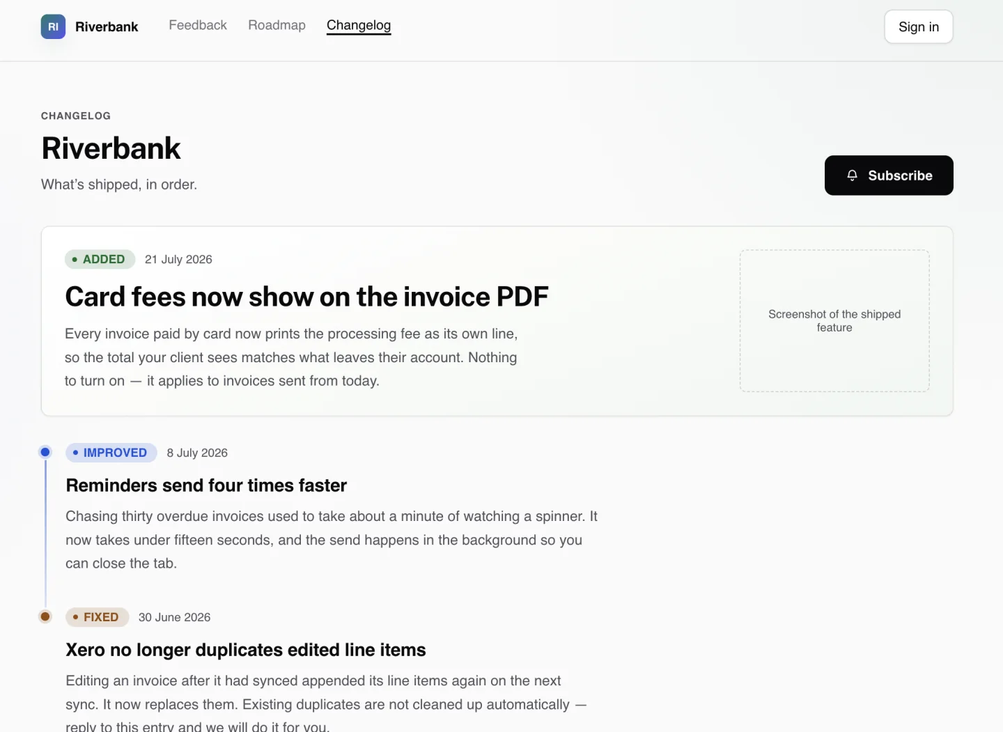
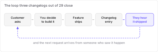
The part that is genuinely different is underneath each entry. An entry names the request it closes and how many people voted for it — This closes: "Show card fees on the invoice PDF", 22 votes — and publishing that entry emails every one of those voters. The link between the entry and the requests it closes is stored as a relationship in the product, so the notification is automatic rather than a mailing list somebody keeps up to date. Each board keeps its own changelog, so a company with two products publishes two histories rather than one mixed feed.
Of the sixteen pages here, nolby and Sketch are the only two that do all four things — date every entry, label it, offer a way to subscribe, and point back at the request that asked for it — and Sketch dates its entries relatively rather than by day.
What to take from it: the changelog can be the last step of a feedback loop rather than a separate publishing chore. Someone asks, people vote, you build it, and the people who asked hear that it shipped without anyone remembering to tell them.
2. Linear
Linear's changelog puts the date in the left margin and uses labelled sections such as Fixes, Improvements, Keyboard shortcuts, API and MCP server. Each entry gets a large product image. It also sits under a broader “Now” page alongside Product launches, From the team, From the community and Press.
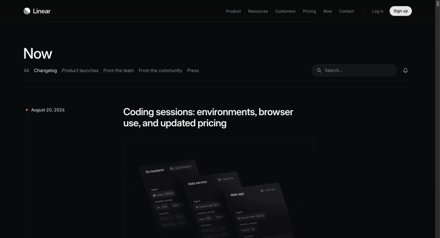
Its newest entry is August 20, 2026.
What to take from it: make releases easy to scan. If one update contains several changes, labelled sections can be more useful than one long block of prose.
3. Attio
Attio's changelog is headed “What's new”. An email field and Subscribe button sit at the top. Below them, a scrubber runs from 2021 to 2026, with a tick for each release, and a counter reads “50 updates” for the year. Entries use tags such as Design, Feature and Enhancement.
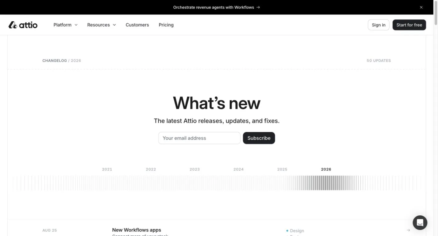
Its newest entry is Aug 25.
What to take from it: make the history itself useful. A changelog can communicate the rhythm of product development as well as individual releases.
4. Glide
Glide's changelog gives each entry two tags, drawn from improvement, feature, fix, security and release. One entry can bundle several changes under their own sub-headings. There are six pages of history, paginated, and each entry ends with a call to action.
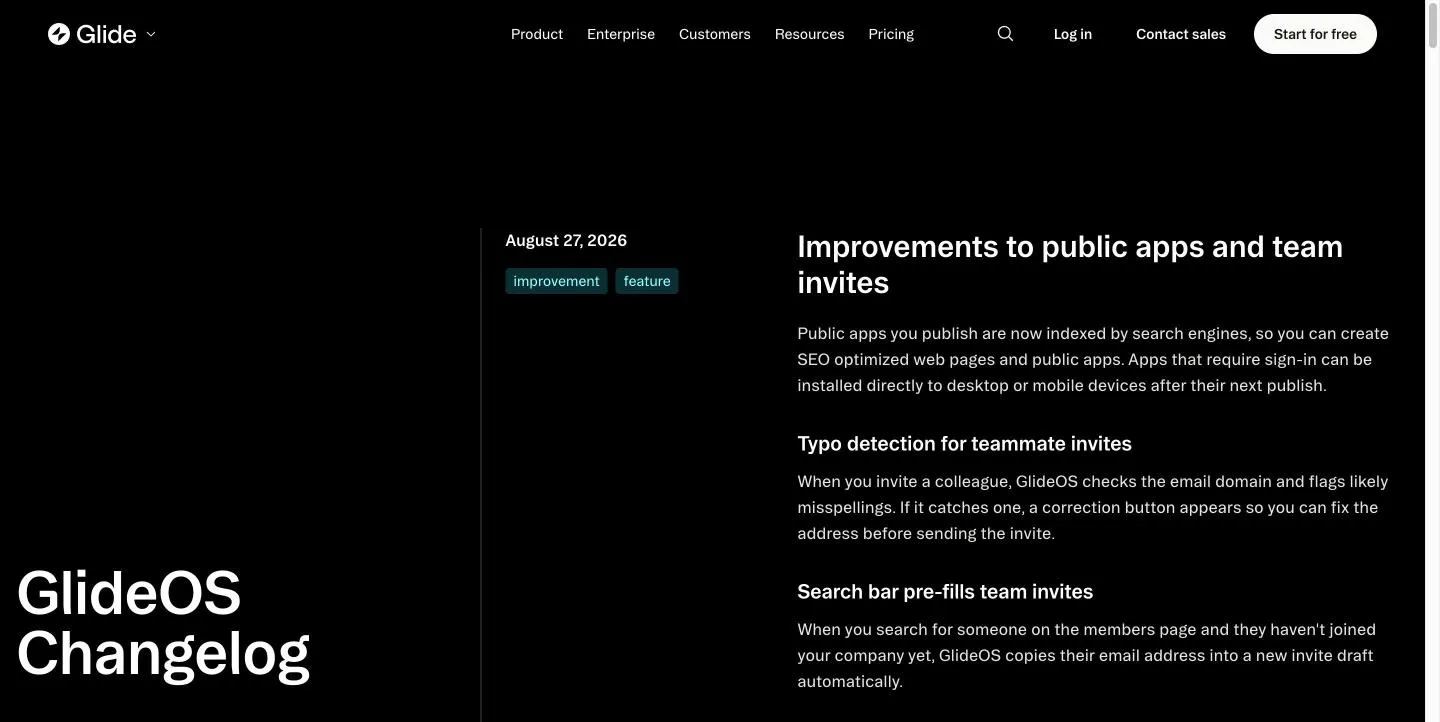
Its newest entry is August 27, 2026.
What to take from it: use a small set of meaningful tags, and bundle related changes when that makes a release easier to understand.
5. Notion
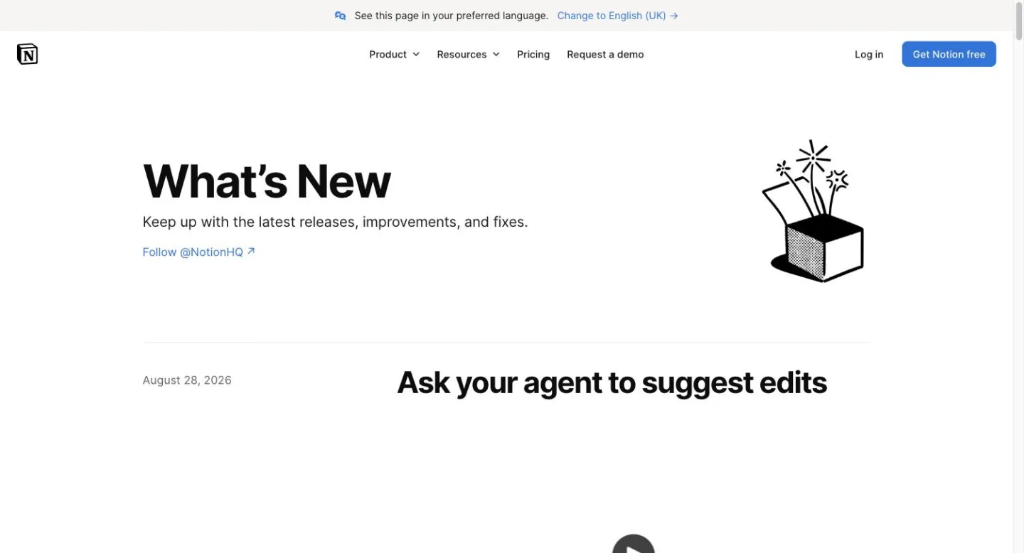
Notion's release page is deliberately simple. It is headed “What's New”; the date sits on the left, while the headline and a video or screenshot sit on the right. Entries run to about three lines and have no categories or tags. The page points readers to @NotionHQ on Twitter as the way to follow updates.
Its newest entry is August 28, 2026.
What to take from it: do not add structure just because other changelogs have it. A short explanation and a good visual can be enough.
6. PlanetScale
PlanetScale's changelog is almost minimal. The opening line offers the RSS feed. The page uses monospaced type throughout, and entries are one-line links leading to the detail. There are no categories.
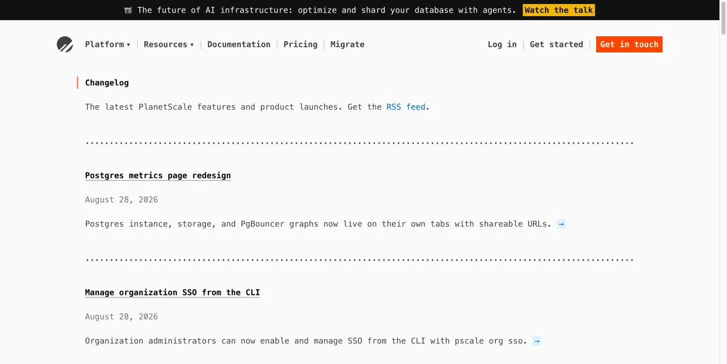
Its newest entry is August 28, 2026.
What to take from it: a changelog does not have to look like a marketing page. If customers want a lightweight stream of changes, make subscribing easy.
7. Geckoboard
Geckoboard's updates puts dates in the left margin and presents every update as a card with a “New!” badge and feature screenshot. Entries link to numbered pages, so an individual update can be linked to directly.
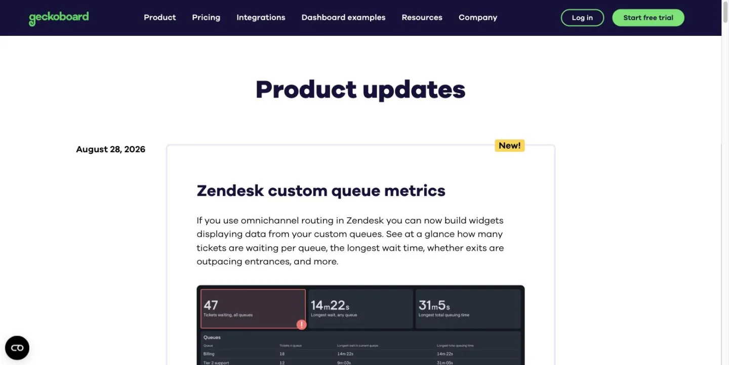
Its newest entry is August 28, 2026.
What to take from it: give individual updates their own destination so a specific release can be shared directly.
8. Slack
Slack's release notes split updates by platform — iOS, Android, Mac, Windows — plus beta channels. Each entry has a version number and date, followed by a “Bug fixes” heading. Its 31 August 2026 entry says nothing significant shipped and describes work happening “behind the curtain in between scenes at a play”.
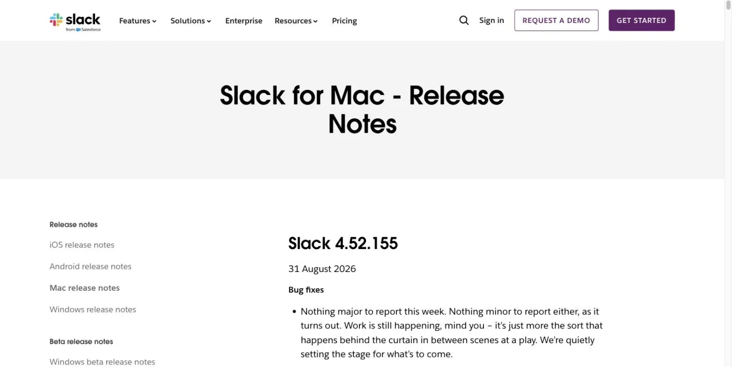
What to take from it: do not manufacture excitement. A changelog can be straightforward about quieter releases.
9. Intercom
Intercom's changes page labels entries by product area — such as Inbox, Phone, Reporting, Fin, Data Connectors — and change type, such as New. Each is signed by the person who shipped it — “Shared by Daniel” — with their photograph, and has a large hero image. The header promises weekly updates.
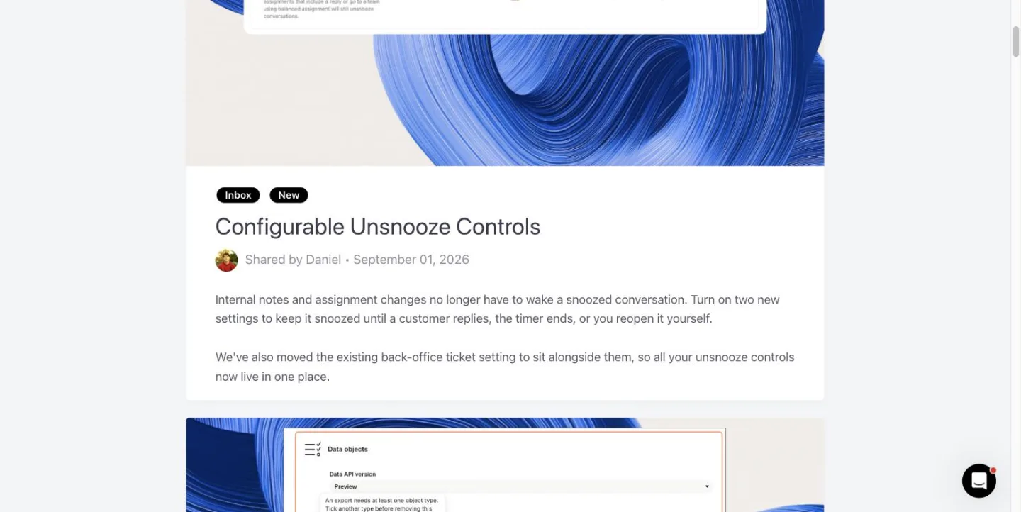
Its newest entry is September 01, 2026.
What to take from it: give product updates a human voice. A changelog does not have to read like an anonymous engineering log.
10. Figma
Figma's release notes puts distribution directly above the entries with “Copy RSS feed URL” and Filter controls. Tags mix the kind of change, such as New release or Update, with the relevant product or feature area.
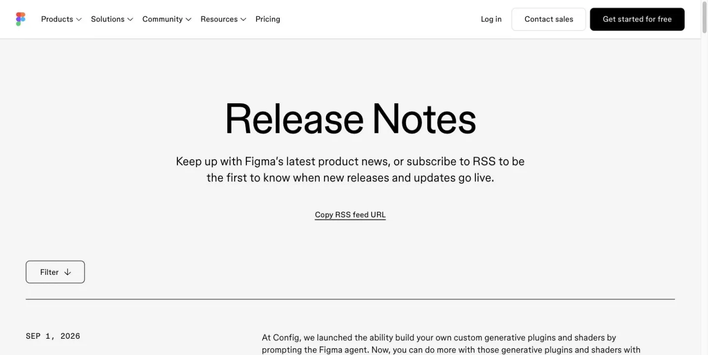
Its newest entry is Sep 1, 2026.
Figma is also one of four examples here that offers a direct way to subscribe.
What to take from it: let readers filter a busy changelog and give them a simple subscription mechanism.
11. Framer
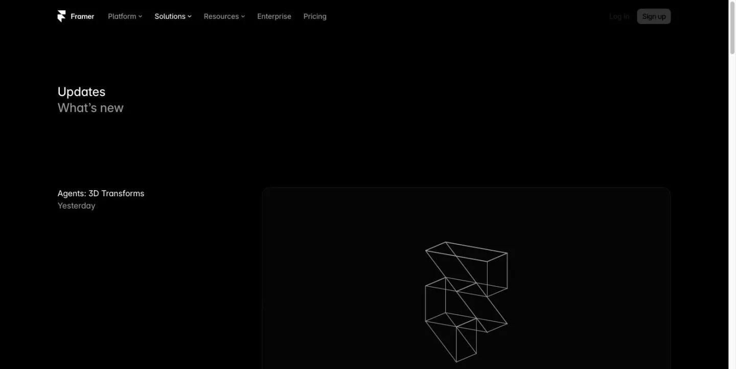
Framer's updates uses a simple split layout: title and date on the left, media on the right. There are no categories or subscription option. The newest entry is labelled “Yesterday”, and the page uses relative dates throughout, so it never states the calendar date of a change.
What to take from it: the short-title-plus-media format is easy to scan. What to consider: relative dates communicate freshness but are weaker as a historical record.
12. Plausible
Plausible's changelog opens by pointing readers to its feedback board: “Take a look at our feedback board to see what's coming next.” Entries have a date and prose, with no tags. Following happens on social. The introduction also says the product updates several times a week but the changelog lists only the major changes.
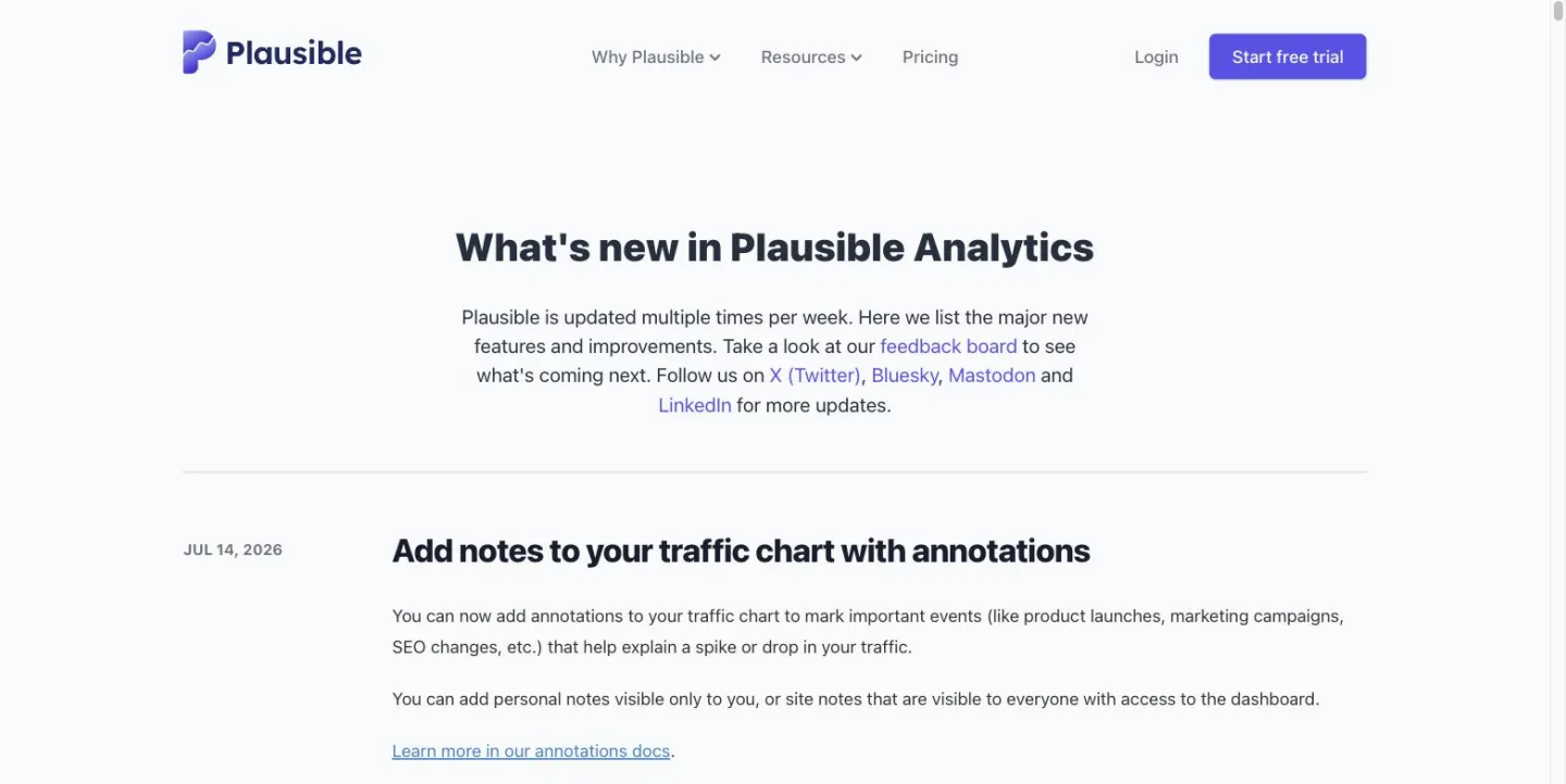
Its newest entry is Jul 14, 2026.
Plausible is one of only two examples here that links a shipped entry back to the request that asked for it.
What to take from it: connect your changelog to customer feedback, and be selective about which changes deserve an entry.
13. Sketch
Sketch's changelog names releases — for example, “Florence (2026.3)” — and tags them by app: MAC APP, WEB APP, IOS APP. An RSS icon sits at the top right. The page also says “if you're missing something specific, let us know!” and links to its feature-requests page.
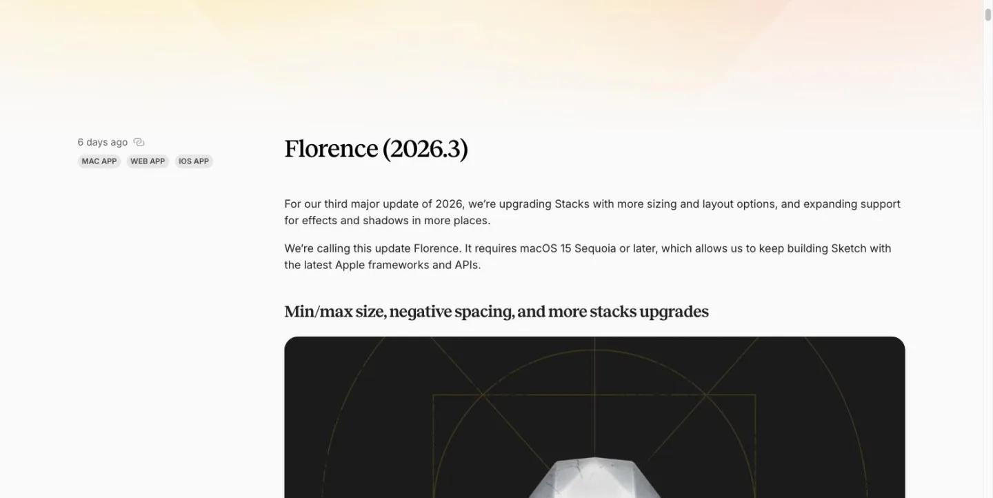
Its newest entry is 6 days ago; dates are relative.
Sketch is the other example here that links a shipped entry back to the request that asked for it.
What to take from it: make the changelog part of the feedback loop, not a separate publishing task.
14. Lemon Squeezy
Lemon Squeezy's changelog credits the people who built each release under “Brought to life by”, showing their names, roles and photographs. Smaller changes are grouped under “Fixes & Improvements”. One checkout localisation release shipped with 34 languages.
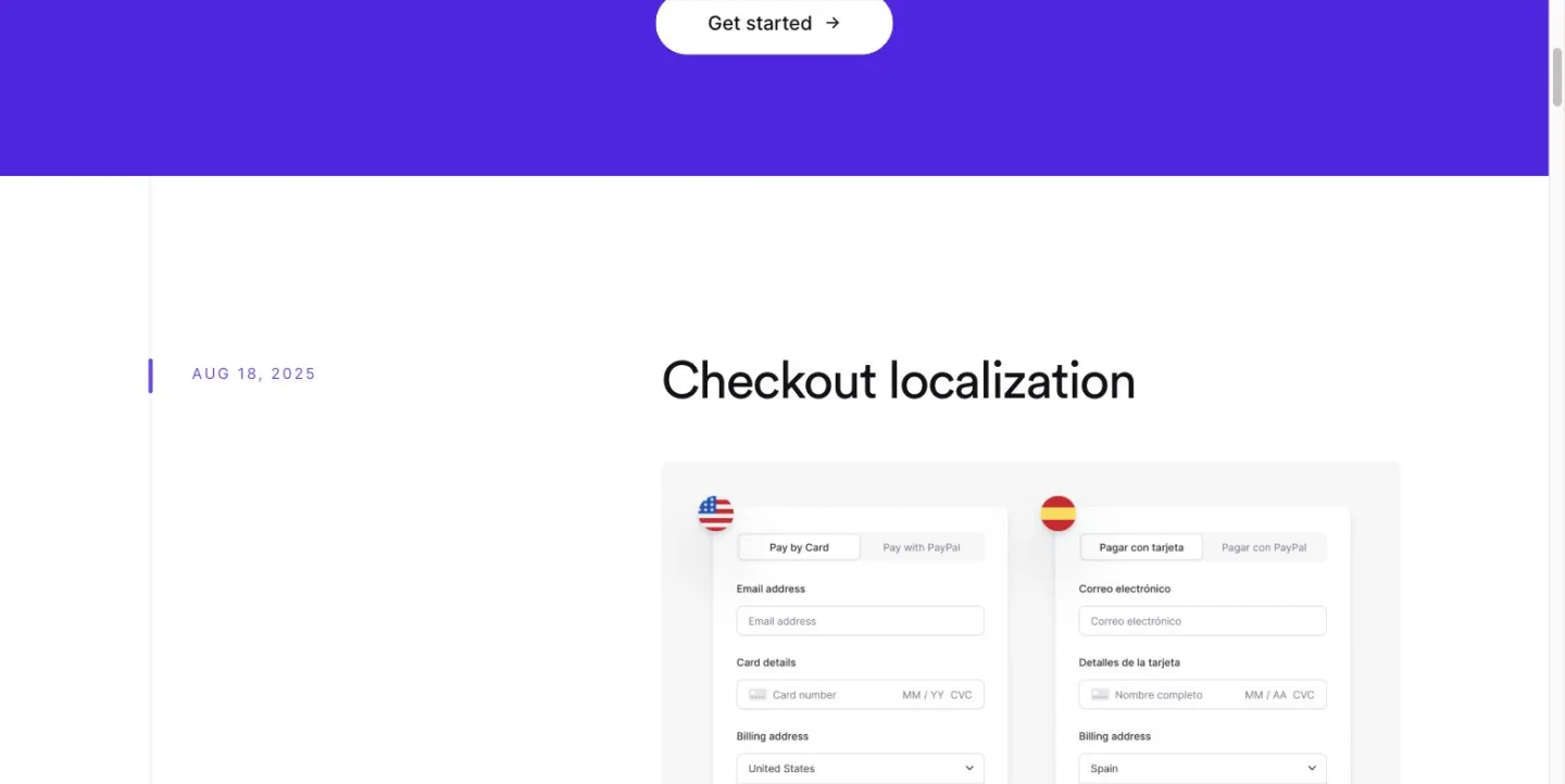
Its newest entry is Aug 18, 2025, and nothing has been published since.
What to take from it: putting people behind the work can make product updates feel less anonymous. The page is still structurally useful even though its publishing has gone quiet.
15. Hotjar
Hotjar's updates has a filter rail covering Announcement, Feedback, Improvement, Integrations, Interviews, New, Recordings and Surveys. Entries have share buttons and three emoji reactions, giving readers a lightweight way to respond.
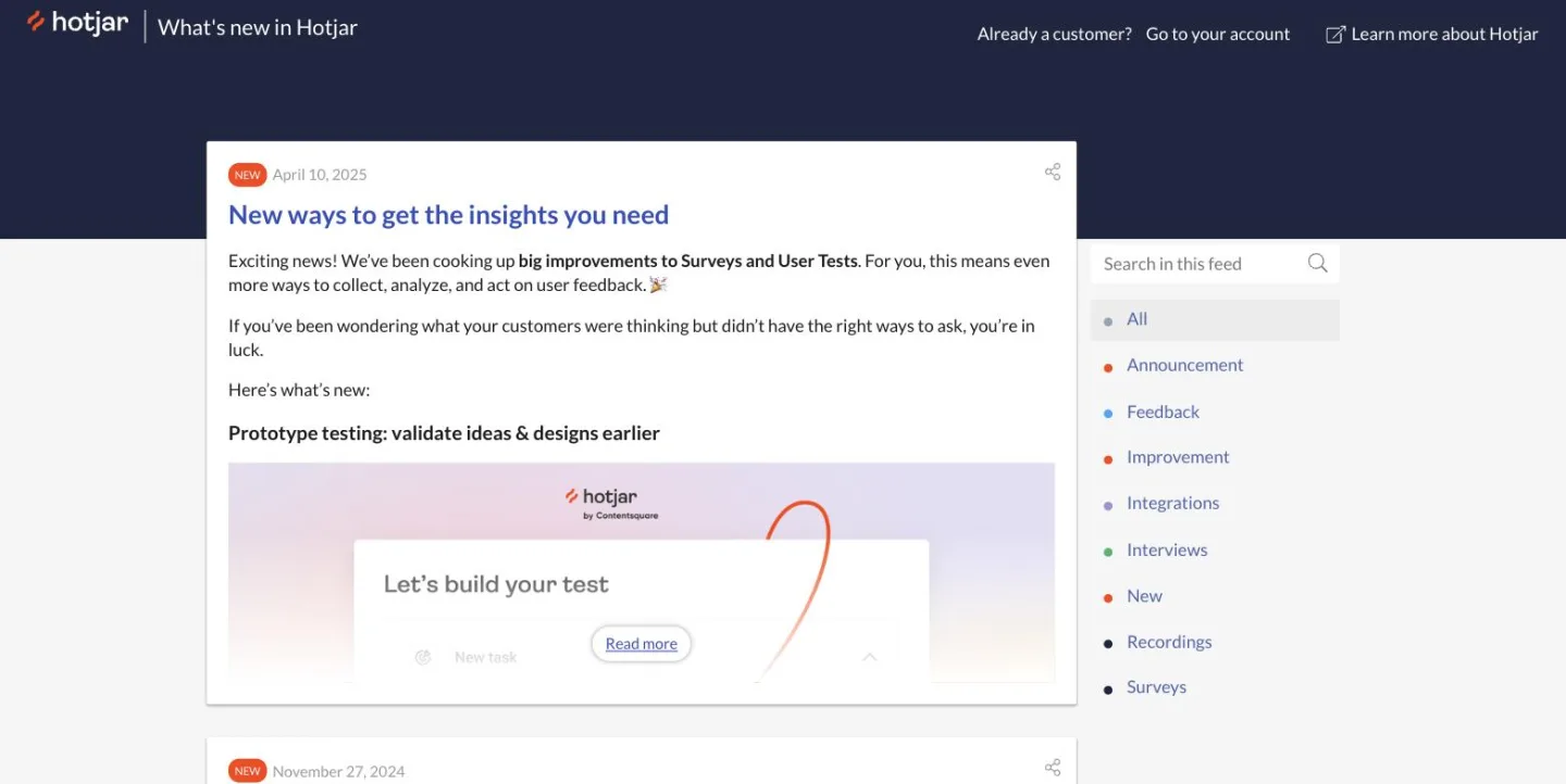
Its newest entry is April 10, 2025; the one below it is from November 2024.
It is a good example of how much useful structure a changelog can contain — and a reminder that sophisticated presentation does not remove the need to keep publishing.
What to take from it: filters can make a substantial archive easier to navigate, and reactions can give readers an easy response mechanism.
16. Family
Family's changelog puts the date on the left and category on the right. Changes are grouped under Updated and Improved, and filter chips let readers narrow the page to one part of the product.
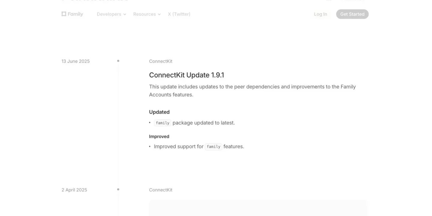
Its newest entry is 13 June 2025, and nothing has been added since.
The page is a useful example of restrained categorisation: enough structure to make browsing easier without letting the interface overwhelm the updates.
What to take from it: use a small number of useful categories and add filtering when your product has enough breadth to justify it.
What a good changelog entry contains
The examples above look very different, but the basic building blocks are remarkably consistent.
1. A date
Put the date somewhere obvious.
The purpose of a changelog is partly chronological, so readers should not have to guess when something happened.
There is one wrinkle: relative dates.
Framer uses “Yesterday”, while Sketch uses “6 days ago”. Those are excellent at communicating freshness, but less useful as historical records because the wording changes over time.
If you want your changelog to remain useful months or years later, a calendar date is the safer choice.
2. A category
Categories help readers decide what matters to them.
They can describe the type of change — such as a feature, improvement or fix — or the part of the product affected.
Attio, Glide, Intercom, Figma, Sketch, Hotjar and Family all use different versions of this idea.
You do not need a complicated taxonomy. Start with a few categories that make sense to your customers. If nobody benefits from filtering by category, you probably do not need twelve of them.
3. A customer-focused description
The easiest mistake to make when writing a changelog is to describe the work rather than the result.
“We rebuilt the dashboard filtering system” is an engineering description.
“You can now filter your dashboard by the metrics you care about” tells the customer what they get.
The second approach is usually more useful.
Your customer does not need every technical detail behind a feature. They need to understand what has changed and why they might want to use it.
4. A picture
A screenshot is often the quickest way to explain a product change.
If you have added a button, show the button.
If you have redesigned a screen, show the screen.
Several of the examples above make media a major part of the entry, including Linear, Notion, Geckoboard, Intercom and Framer.
The visual does not need to be elaborate. It just needs to help the customer understand what they are looking at.
How often should you update a changelog?
This is where the advice to “publish regularly” can become unhelpful.
Regularly means different things for different products.
A small SaaS company with one person handling product may not have something substantial to announce every week. Another product might have meaningful updates several times a week.
The better rule is to choose a publishing rhythm you can actually maintain.
Plausible offers an especially useful example: its product updates several times a week, but its changelog lists only the major changes.
That means your changelog does not have to become a transcript of everything your engineers touched. It should be a useful record for customers.
Hotjar, Family and Lemon Squeezy also show the other side of the equation: their pages are structurally useful, but their newest entries are over a year old. A quiet changelog is not a verdict on the product; it simply is not an active update channel. Start with a rhythm you can actually maintain.
How do customers find out about new entries?
A changelog only works as communication if people know it exists. Three straightforward distribution options are:
- In-app: show a notification or update feed inside your product.
- Email: send customers an announcement when something meaningful ships.
- RSS: let customers subscribe to the release stream.
The examples take different approaches.
Attio puts an email field and Subscribe button at the top of the page. Figma has a Copy RSS feed URL control. PlanetScale opens with its RSS feed. Sketch has an RSS icon.
Other products rely on different channels. Notion points readers towards @NotionHQ on Twitter, while Plausible uses social.
You do not need every channel. The important thing is to make discovery deliberate rather than expecting customers to remember to visit the page.
Close the loop when a customer asks for something
This is one of the most useful ideas in these examples.
Plausible and Sketch both connect shipped work back to customer requests.
Feature requests can disappear into the product process after someone submits them. The changelog is an obvious place to close that loop: when the feature ships, tell the people who asked for it. It turns “we heard you” into something concrete: you asked for this, and now it exists.
This is also where customer feedback software and changelogs naturally fit together.
A feedback board tells you what customers want. A roadmap tells them what you are considering. A changelog tells everyone what actually shipped.
They are different parts of the same product conversation.
nolby takes that connection literally: publishing a changelog entry can automatically email the people who voted for the feedback posts that entry closes.
Your changelog is a maintenance commitment
It is tempting to treat a changelog as a design project.
Choose a layout.
Add some filters.
Create attractive cards.
Take screenshots.
Publish the page.
Done.
But the examples above suggest that the more important decision comes before any of that:
How much changelog can you realistically maintain?
A sophisticated page is not automatically a better changelog. Some use filtering, reactions, subscriptions, images and contributor profiles; others use little more than a date, sentence and link. Both can work. The important thing is whether customers understand what changed — and whether you will keep using it.
Start with the essentials: date, useful category, customer-focused description and a picture. Give people a way to discover new entries. If you collect feedback, tell the people who asked when their request ships. That is enough to build a useful changelog.
The best changelog is not necessarily the most beautiful one.
It is the one your customers can understand — and the one you can keep writing.
SaaS changelog FAQs
How often should I update my changelog?
Update your changelog whenever you ship a meaningful customer-facing change, but choose a cadence you can maintain. There is no value in publishing several entries at once and then going silent. The goal is a steady record of product progress that customers can rely on.
Should I include every single change?
No. A changelog should focus on changes that are useful or interesting to customers. Minor internal work does not necessarily need an entry. A good test is whether the change gives the user something new, improves something they use, or answers a question they might reasonably have about the product.
Should my changelog be public or private?
For a customer-facing SaaS product, a public changelog makes it easy for existing and prospective customers to understand product changes. A private record can still be useful internally, but it serves a different purpose.
How do I get more people to read my changelog?
Do not rely on people remembering to visit the page. Tell them when something meaningful ships. Common options include an in-app widget, email and RSS. A subscription option is also useful because it lets customers receive updates without having to remember to check the page themselves.
What is the difference between a changelog and release notes?
The terms overlap, and the examples use both. A changelog is generally a chronological record of product changes, while release notes often explain what changed in a particular release or period. In practice, many SaaS products use the terms interchangeably.
Final thought
A changelog does not need to be complicated. It needs to answer four questions: What changed? When did it change? Why should I care? Where can I see it?
Get those right, connect releases back to customer feedback where useful, and choose a format you can keep using. A changelog is not really a page you build. It is a habit you keep.